I’ve been to a whole host of shows over the past few weeks which I haven’t written about so here is what I think of a few of them
Days Like These - Tate Britain
I had been looking forward to seeing this show, I’d even came over to see it once before but found it closed as I was a day too early! Inevitably because of my high expectations it was disappointing and even the inclusion of a few of my current favourites didn’t stop the overall dull and depressing atmosphere.
Richard Hamilton’s controversial inclusion was an interesting idea that really didn’t work, he seems to be desperately trying to keep up with the latest trends but his video, drawings and Marcel Duchamp piece were uninspiring and vacuous. George Shaw and Peter Doig’s paintings are great but they were hung in a room with Shizuka Yokomizo’s exceedingly plain series of Stranger photographs – a curatorial thread I really couldn’t follow. In fact the curating as a whole was half hearted and the presentation was far too slick, this show says nothing about the current trends in British art.
As much as I may have criticised the current Becks Futures in an earlier review it did have that homespun, anti-corporate, diy thing going for it, something Days Like These attempted to reflect by the inclusion of Margaret Barron. Barron paints on pieces of sticky tape, which she then fixes on to a surface close to the scene she has painted. The show info. delighted in telling us that they couldn’t vouch for the longevity of the outdoor paintings, but there were also meant to be some inside the gallery. I really wanted to find them but hard as I tried I couldn't track them down.
There were also lots of film and video pieces and it is one of these that was the star of the show. Nick Relph and Oliver Payne’s film Gentlemen was brilliant. It was as I wrote in my notes as I watched it “so punk, so angry, so lethargic – poetry with images”. The film consists of mainly out of focus shots of tinsel, bright lights and urinals with a cutting voice over, and is a kind of love/hate message to the tacky, corporate culture of London’s famous streets. There is a kind of Oliver Twist / Steptoe feel to it; a mixed mocking of the old culture whilst still hanging on to an affection for it. The very feeling that infuses current English sensibilities.
Despite Relph and Payne’s beacon of light the whole show was very unsatisfying and didn’t work, it was trying to do everything and ended up saying nothing.
The Jerwood Painting Prize
This is another show I wanted to and expected to like. I have seen the last five shows of this annual painting competition and they have always been an interesting and varied mix of young and older painters. This one was just terrible! The work on show just seemed really old fashioned – John Wonnacott! John Hoyland! Shani Rhys James’s revoltingly coloured figurative compositions follow in the footsteps of Paula Rego but are completely superfluous in a world that already has Paula Rego. The most successful room features minimalist compositions by Marc Vaux – metal frames containing an inner frame of brightly painted wooden bars - and Alison Watt’s large paintings of fabric folds.
So what apart from the establishment reputation of the painters is my beef? Well… where is the humour? Where once again is the obtainable diy aesthetic? Why is everything roughly the same size – monumental (last year there were some gorgeous tiny paintings by Pamela Golden)? And most importantly where is the excitement?
If you have read my earlier blogs you may know that I entered this prize and was rejected, well I am not surprised. These painters are from a different art world; they are all very firmly routed in the routine commerciality of Cork Street and have nothing to do with pushing boundaries. This prize is not for me!
Paperworks @ Kate Macgarry
At last a show I liked! This is a new gallery to me, I was enticed to see it by this shows candy coloured email list of the participating artists and the inclusion of Lily van der Stokker (who I have read about but never seen).
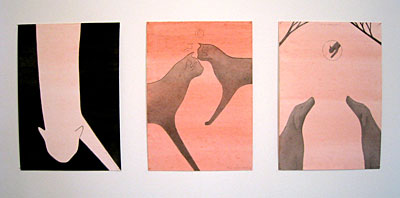
The gallery is in the newly fashionable Redchurch Street (London E2) and is a small but beautifully formed space. The work as suggested by the title is all on paper (apart from kathrin Bohm’s screen print and installation) and is a mixture of quirky watercolours, cutout constructions and collages. I really loved Michael Harrison’s Cat watercolours. These are not cute, chocolate box cats but sleek, mystical, Egyptian style cats. The works are called things like Teaser and Crossed Destinies. I also liked Luke Gottelier’s bunch of watercolours entitled Cowslips, they are colourful, joyful and non-reverential. My favourite pieces however are by the fore mentioned Lily van der Stokker, little coloured pencil sketches entitled things like Grandmother and Grandfather (design for wall painting with seating). They are I expect exactly what their titles suggest and are executed in a heart-felt style.
An uplifting show, I look forward to the next one in this inspiring space by the charmingly off beat Francis Upritchard.
http://www.katemacgarry.com