Galleries Online
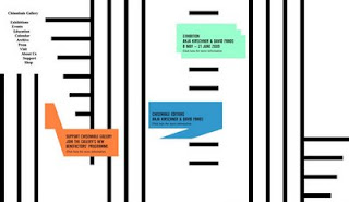
I have been looking at gallery websites, trying to find ones I like to give me some ideas for updates I need to do on the Transition Gallery website. Mostly they are pretty bad but I did quite like Domobaal, and Crimes Town for their simplicity. Design wise Bloomberg Space and Chisenhale Gallery are pretty interesting. Also quite liked Artangel's although it is a bit too clever for its own good with all that complex moving graphics stuff. Oh and I only looked at galleries beginning with A, B, C and D as the whole thing got really arduous - so if there are any other goodies that I should check out please let me know.
5 comments:
I hate gallery sites that use complicated animation and transition graphics (FLASH9) and then only provide weeny little reproductions - like www.haunchofvension.com
Actually I don't think the pages there even open properly. The current Keith Coventry show page doesn't scroll and none of the thumbnails link (although they're meant to).
I like basic sites that give nice large (larger the better) JPGs -
The Approach will do me...
Not sure what it looks like now but the old White Cube site used to be soo annoying with all that flash stuff and took you forever to get to the artists work.
The Approach site is great - very no nonsense and easy to navigate
Hi Cathy,
Take a look at this one from overseas. Though perhaps is a bit too complicate...
www.apicearte.com
Hope you are fine!
Gabriel
I agree that websites that take ages to load their flash animations and don't provide a chance to skip the tedious intro are truly annoying. Likewise, websites with too much informations left right and center, that leave you totally uncoordinated, and at worst, give you a panic attack, like the Saatchi website.
Having said this, I do like this website (and great gallery too)> Deitch Projects. If you can stand the music (which you can silence by the way)
Also like the Serpentine Gallery website.
thought I'd offer up my own website to opinion...www.failedrockstar.org
I deliberately wanted to keep it easy to navigate but still look good, I like it but then I'm close to it and may not easily be able to see the faults, and I'm sure it's not perfect! I know it's not a gallery site but it's very art related.
Post a Comment