Saturday, April 12, 2003


Scritch Scratch @ Transition


Mark Croxford, Annabel Dover, Delaine Le Bas, Alex Michon, Marcus Oakley


Last night was the fantastic private view of the brilliant Scritch Scratch. The show examines a particular type of drawing, that cares nothing for the formality and tradition of the medium. It also looks great, and has a really unified feel to it.

Alex Michon's
drawings on brown card are scintilatingly current, juxtaposing the war with an arcadian idyll. While her "Material Interventions" are all homespun nicey, nicey with added blood.
Delaine Le Bas's
three framed drawings once again include stong images of for instance skeletons amongst their highly coloured surfaces. Her fabric and glass piece is powerfully entitled "Fucking Hell it Makes my Heart Bleed" and contains a complex series of violently graffitied layers.
Annabel Dover
has one large painting in the show - "Christening Gown". A shimmering dress proportioned to fit a ghostly, giant baby. It hovers in front of the viewer as they enter the gallery, its goya-esque white brushstrokes seemingly lifting it away from its rollered black background.
Mark Croxford
shows a series of architectural mirror drawings. Their over painted terracotta surfaces scratched away to reveal the magical, silvery mirror beneath.
Marcus Oakley's
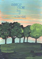
work is presented in two clustered installations and has a quality of visionary innocence about it. Each cluster is a mixture of framed drawings, paintings on found board and sewn textile pieces. Some of the paintings have quirky slogans in speech bubbles. A country cottage says "Summer means new love" and a cartoony animal says "peace". The most telling slogan is above a tree lined landscape and says "Everyone knows this is nowhere", this is powerful work.

Of course I am a little biased as I did curate the show but... it is really good. Don't miss it .


Transition, 110a Lauriston Road, london E9


Becks Futures @ The ICA


8th April 2003

I don’t dislike the ICA, in fact I really like it and I think that they have put on lots of really good shows but…

This years’ Becks Futures has work by nine artists and as a friend said “it is the first group show I have been to where all the work looks like it was made by the same person”. There were a lot of quite boring videos and lots of very quirky projects and ultimately it was all pretty hollow.

The stand out things are:

1: Francis Upritchard – Funny Girl

I like Francis Upritchard especially since I recently found out that she is a girl rather than a boy. I saw her work at The Bart Wells Institute a few months ago and it was very funny. For Becks she has made a crappy little mummy complete with a B&H packet in its top pocket which moans and quivers, next to this are some vases which have a kind of Egyptian look about them (these are the things I saw before, the vases are 'found' but the egyptian cats heads on them are added by the artist) She is also showing a glass vitrine documenting evidence that Prince Charles is an Anti-Christ (complete with the only paintings in the show)


2: David Sherry – Artist as Christ

David Sherry sewed balsa wood on to his feet and videoed the process. This video is in the show it and is horrible, I could only watch it for a few minutes but, it was memorable. The same artist also had a plain old computer printer set up which spits out sheets of written text and illustrations. There is a notice inviting the audience to help themselves (I always like a freebie) It turned out to be a diary of a month the artist spend trying not to touch another human being.


3: The inclusion of Iventory in the Show

Inventory is a magazine / journal. The fact that this makes it able to be included in the show is exciting. Unfortunately I have never been able to understand much of it and the documented work displayed here is quite boring


Sunday, March 30, 2003


I've left the Tresco paradise and am now back in lovely East London. On my way home I managed to fit in a visit to St Ives (see the review of The Tate below) which was worth it for the amazing train journey alone. I was sad to leave The Scilly Isles (and Cornwall in general) but its good to get back to civilisation (as the nice Tresco bike hire man said).

'Daying' at Transition has now finished and at the weekend I am going to start putting up the next show 'Scritch Scratch' which I am curating. It is going to be really interesting with an eclectic mix of contributors and is very succinctly a new appraisal of drawing. I will give more details in my next entry.


The Tate St Ives


http://www.tate.org.uk/stives/default.htm


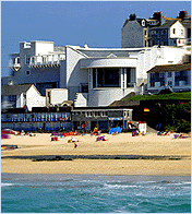
The Tate St Ives is a good looking building (kind of reconstructed 30s industrial) and the beachside location is stunning but it seems to operate on a reverse tardis principal with much less room inside than is apparent from the outside. Consequently I’ve always found shows here a bit of a let down (I remember a particularly insipidly small Rothko one), this current display however seems to work.

There are three major things going on in the gallery at the moment.

Terry Frost
– a retrospective, a room of new work and another small room of his selections from the Tate collection. I found his new work a little bland and the old work a little tired; I did however enjoy his collection selection, which included Reinhart, Delaney, Kandinsky and Barnett Newman.

Pier Arts Centre Collection
– The Orkneys’ Pier Arts Centre is being renovated, so for a year some of its collection of ‘St Ives’ artists is on loan to the Tate. Initial thoughts are that this is a standard selection of St Ives’ work (although it does include some gems by Alfred Wallis, Ben Nicholson etc). What however makes it different is the way it’s shown. The artist Julie Roberts (one of the three showing in ‘Painting Not Painting’) has designed Barbara Hepworth wallpaper, which lines the gallery. The shock of the non-white walls is one thing but a patterned wall in an art gallery is quite fantastic! The wallpaper image is of Hepworth in baggy boiler suit equipped with a hammer and chisel sculpting away at one of her trademark organic, oval shapes. The colours are beautifully nostalgic and the handmade, screen printed surface is a homely English version of Warhol’s cow paper. It lifts the art hung upon it to a new level and for the first time I can feel the excitement that the incoming Nicholson felt when he first saw Alfred Wallis’ paintings whilst his own fireworks and Coty paintings are revitalised and compelling.

Painting Not Painting
– Julie Roberts, Jim Lambie and Victoria Morton. This is a commendable effort to investigate the diverging practices that make up contemporary painting. Jim Lambie is really more of a sculptor and his ‘zoobop’ must surely be one of the most over exposed art pieces of the 21st Century. If you haven’t yet seen it, it is a custom made floor covering made up of strips of different coloured tape which together form a kind of psychedelic, stripy lino. Victoria Morton does abstract canvases. The catalogue essay attempts to place her in some new kind of category where the artist works into the space of the canvas using gestural marks but I’m not sure I go for it. Colours are nice though. The most interesting work for me is that of the fore mentioned wallpaper designer, Julie Roberts. I haven’t heard of her before but judging by her cv she’s been around a while and despite my disappointment when I read that she is interested in examining the depiction and role of women in art (a prejudice of 20th Century Feminist art that I should get over!) her work was fascinating. Roberts has painted the walls of a small room with watercolour so it resembles faded Victorian wallpaper. Upon this are hung a series of her precisely made drawings of the victims of Jack The Ripper based on research made in the public records library. Although fairly gruesome (one in particular) they gave a peculiar dignity to these women who are only remembered because of their deaths. The understatedness of the installation is a fantastic subtle contrast to the bombastic nature of Lambie’s ‘Zoobop’.

The message I took away was that painting has expanded its boundaries and anything can now be included within its remit, including sculpture, drawing and installation. This is I think a very positive development.

Overall the gallery is as interesting as its ever been, so head down to St Ives before the summer surf crowd take it over.

Thursday, March 27, 2003


Gallery Tresco


On Tuesday night I went to one of the weekly ‘private Views’ that are held at Gallery Tresco. As the name suggests this is ‘the’ gallery on Tresco and shows work by many of Cornwall’s top artists.

The current show is an eclectic mix of a large number of artists who all use the islands as their inspiration. Unfortunately the buying audience here is a little (and I am being very generous here) on the conservative side and both the gallery and the showing artists have to engage with this commercial reality, thus a lot of the work looks a little chocolate boxy. There is also an inherent problem when painting the landscape, especially one as beautiful and light filled as this one, which is how to make it look and feel contemporary. I know that every time I come here I take photos but I also bring my watercolours because the landscape is so uniquely stunning that I feel compelled to try and capture it. The inevitable landscape painting quandary is which route to take; the abstract route (I always feel this is a cop out), the simplification method (used to great effect by the late John Miller but which now looks like a Greek holiday poster), accentuated colours (too fauvist) or in the end not worrying and just making ‘nicey, nicey’ watercolours (which is what I and a lot of other artists end up doing).

Back to the gallery and my top three picks. Mike Hindle’s colour rich, semi-abstract watercolours,


Kathy Todd’s atmospheric, carefully stippled strips of sand dunes and my number one choice Harriet Barber’s painterly oil on board seascapes. Barber’s paintings are refreshingly raw, colour piled on in an effort to summon up the emotion of the place rather than worrying to much about accuracies They have an endearing hint of the naïve about them which is only spoiled by some over elaborate framing, unfortunately a common gallery problem (the most popular choice is lime washed wood which I’m afraid looks very Ikea and old hat). It would look so refreshing if all the work on show was pinned to the walls with drawing pins, but this is probably just my art school sensibility and the buying public obviously likes to take a nicely framed souvenir home with them.

Gallery Tresco will I am sure go from strength to strength and who knows maybe they will find a contemporary gem along the way. I’m looking forward to the day when Tresco Gallery Projects opens and artists attempt to place the Island beauty within some kind of larger socio-political context. It would also be fantastic to see media other than paint in engagement with this beautiful last of England landscape.


Monday, March 24, 2003

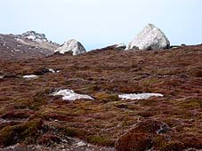
So today I went on a 'hike' to the wild Northerly end of the island. It's much more desolate over there,
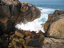
moorland fringed by rugged rocks and caves


It was very exhilerating, the spell of isolation only broken by packs of hellooing pensioner hikers.


Saturday, March 22, 2003

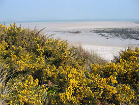
Here I am in the arcadian paradise of Tresco which is 20 miles off the coast of the most southernly tip of England.
To borrow from Derek Jarman this really is "The Last of England".


Annie Metcalfe, Annie Henry, Mat McIvor


PALM RESTAURANT

4-6 New Road, Newlyn, Cornwall
(www.palmrestaurant.co.uk)

The Palm is a newish restaurant in Newlyn and shows a changing selection of work by local artists. As the proprietor David Costin said, there aren’t that many places for artists to show work locally as the galleries will only show the big names. As a London artist I have often Patronisingly thought how wonderful it must be in the provinces with all those cool little galleries (such as The Newlyn Gallery) but I now see you have to be either locally famous or interestingly foreign to get your work shown.

The Palm is currently showing work by three artists; Annie Metcalfe (who lives over the road) has been given the wine bar. She paints semi-figurative seascapes and cites her interest as “the intangible area of the point where land meets sea and that momentary experience which occurs at the point of impact”. Her reoccurring motifs are the flotsam and jetsam of the fishing industry, with a series of small square canvases showing cropped images of fishing net floats on the seashore, lusciously painted in bright, fresh colours. In the main area of the restaurant are a series of small bronze sculptures of the human figure by Annie Henry (www.anniehenry.com). Although much smaller they reminded me of some of Anthony Gormley’s work and have an inviting tactile quality to them. Also in the restaurant are a large number of brightly coloured, smoothly painted landscapes by Mat McIvor. Some of these melted into abstraction with structural honeycombs inspired by the Eden Project’s futuristic domes whilst others featured silhouetted skylines reminiscent of Jan Pienkowski’s (www.janpienkowski.com)70’s illustrations, beneath highly coloured stripy skies.

Overall the whole thing became greater than the sum of its parts and the freshness and commitment of the area’s art was what I came away with. David Costin should be commended for his vision in giving over his restaurant to these artists as well as of course the fantastic food on offer

***


I should probably mention that I am on holiday in Cornwall (well the Scilly Isles at the moment to be more precise). So the next (and the previous) group of reviews and pictures will be coming from here.


PENLEE HOUSE
Morrab Road, Penzance Cornwall
www.penleehouse.org.uk

20th March 2003

This gallery is home to the historic collections of Penzance and Penwith district councils and features the largest art collection in West Cornwall with a focus on the paintings from the 'Newlyn School'.

I started off my visit in the traditional way with tea and cakes at the cafe (very good) and a look around the shop (lots of local information and books) before deciding to part with my £2 entrance fee. There were 2 special exhibitions on as well as a selection of paintings from the permanent collection.

The first show was "Copperwork in Cornwall" it was very bright and coppery and gaudy and I suppose beautifully crafted but a bit too much like stuff that hangs up in a pub. In fact I am going to go as far as to say that I hated it! Anyway I was always more interested in the paintings and the other show - "Flash Harry: Photographs by Harry Penhaul" - which sounded much more interesting. In the opening self portrait Flash Harry looks a little like a second world war spiv in the mould of Walker from Dad's Army, a nice guy but a little bit dodgy. He was born in 1914, died young (aged 43) and took some good pictures of local people and events. Characters on show included a strange looking man with a big moustache and a farmer on a tractor drinking from a watering can - all black and white and gritty, like people from a Thomas Hardy novel (I know my timing is a little out but they were the same basic characters unchanged by half a century) Other photographs had happy, skinny kids and smiling country folk and could have been subtitled 'We're all pulling together and much happier than you are now'. "Diverting" I wrote in my notebook.

The final section of the gallery is devoted to the permanent collection. I've seen some of it before and there are some works I really like. Elizabeth Forbes "A Zandvorf Fishgirl" is a very appealing portrait of a young girl holding a basket of fish, downbeat and melancholy in a Gwen John kind of way, all muted blues and greens. "The Fishgirl" is sentimental in that gauche way that Victorians loved but is now soo taboo and I love it.
I also liked Stanhope Forbes' "Regatta Day", T.C Gotch's "Girl In A Cornish Garden" and best of all Harold Harvey's "The Donkey Meadow".

If you find yourself in Penzance check it out.

Sunday, March 16, 2003


Painting Year Zero @
Keith Talent Gallery, Tudor Road, London E9


I like this gallery because its in the same street as my studio and because it seems to have a painting focus.

This show is about... painting - see title. The painting is abstract, featuring macho geometric shapes or maybe I just think this because all five participants are male. Notable works include those by Robert Holyhead whose paintings are very neat and very bright, one is called "Painting with white lines that do not cross" which is a pretty acurate description. Others by Danny Rolph feature psychedelic colours and layers of "twinwall plastic" - these have names which I can not decipher - "Heisterkamp" and "C.S".

Overall the show was diverting but I have to admit that abstract painting is not really my bag.

Thursday, March 13, 2003

Daying @ Transition

Martina Jenne Isabel Ivars Sharone Lifschitz


14th - 30th March


I have just been to the private view of a new show at Transition called Daying. It is a collaborative work made by three artists in a day about a day.

It is a very contemplative show, comprising of a series of photos of things the artists were doing at different times of the day. If you examine it carefully you can identify each artist’s pictures and three separate narratives are revealed.

Visually it is very satisfying linked as it is by a black 'thread' and broken up by numerical time labels. My favourite bit is as you enter the main part of the gallery, in front of you are photos of the three artists just after they have woken up – at the beginning of the time line. To your right are photos of the artists at the end of the day – at the end of the time line. It makes for a pleasing closure to the cyclical nature of 'Daying'.


Saturday, March 08, 2003

Publicness - The ICA
(29th Jan-16th March 2003)

This show features the work of three artists - Jens Haaning, Matthieu Laurette and Aleksandra Mir.

It seems to be about interventions that artists and obviously these three in particular, make in the real world. It is really quite a lame show and its language speaks to those already initiated in the art world yet it trades on the pretext of being inclusive.

The downstairs room features jokes translated into arabic and then posted on to advertising hordings in different cities. Also letters written to various countries requesting citizenship for the artist so she can show under their name at the Venice Biennale.

OK I admit that I didn't look at all of it as carefully as I could of because it bored me, it (the show) was lazy and required too much work from the viewer. It also seemed to patronize the "ordinary" non-artists it was seeking to engage.

Best bits - lookalike pictures from different countries and a collection of wine bottles with artist designed labels.


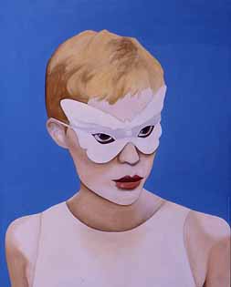
This is Butterfly Girl - one of the paintings from Alleyoops. She is based on a photograph from the 60's of Mia Farrow at a masked ball with Frank Sinatra

Thursday, March 06, 2003

This morning I am waiting at home for some postcards to be delivered. This is the third day that I have been waiting for these cards. It is making me very frustrated as I have about five thousand other things I should be / would rather be doing. The cards are invites for the next four shows coming up at Transition, one of which "Daying" previews next Thursday (13th March) so we urgently need the card so it can be sent out!

When these arrive I am going over to my studio to finish a painting which I am entering for a competition. The painting is called "The Green Flash" and was one that was in my Alleyoops show but I've decided it needs to be changed. This means it must be dry by Saturday when I am delivering it, so I must finish it today, so the postcards must be here soon! The competition is The Jerwood Painting Prize. It is won every year by really well known artists so I have no chance but I've paid my entry fee so what the hell.

Monday, March 03, 2003

So... today I'm taking down my show. A little sad but also quite glad its over as it means

1: I did it
2: I don't have to worry about anything breaking down anymore.

I forgot to mention before that I am the "director" of the gallery as well as the other things I do. We're working on the programme of shows at the moment which are
Daying
Scritch Scratch
Sense and Sensibility
Arty Tecture

I'm also thinking about new art I want to make, but as so often happens post show, can't decide which idea to follow first. So I'll probably check out some other shows this week and write my piece for the new Arty - scandal issue.

Anyway - saw Arsenal yesterday and they won 2:0 against Charlton which means we are 8 points clear. Thierry Henry was great and it made me very happy.


Sunday, March 02, 2003

This is the first entry on my blog. I am an artist and writer and publisher of the art fanzine ARTY. Today is the last day of my show at Transition in East London (110a Lauriston Road, London E9) and I am going to include a review of the show by my fellow artist Alex Michon below


Phantoms of Unease (Reflections on glamour, fetish and transformation)

Alleyoops: Cathy Lomax


Transition Gallery
110a Lauriston Road London E9,
7 Feb – 2 March 2003


“So I turned myself to face me
But I’ve never caught a glimpse
Of how the others must see the faker
I’m much too fast to take that test”
Changes – David Bowie


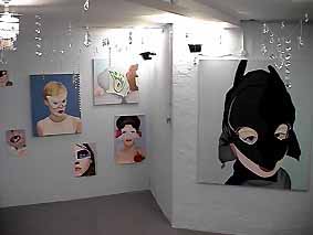
On entering the gallery (through a narrow corridor) the viewer is confronted by a full-length mirror which inadvertently screams. The effect is disconcerting, inducing a slight gasp which literally makes the viewer take a step back (in skateboarding terms alleyoops means to skate backwards) this feeling of being “tripped up” or caught in the site of unknowing is further explored in the main room of the gallery which is filled with various portraits of masked figures. They range from paintings of children1 to images taken from fashion magazines (Blitz Girl, Fashion Girl, Wonder Girl) to the more sinister Fetish Girl (with all the inherent connotations of sexual deviance and to the music hall grotesque of Victorian pornography in The Deadly Phantom The titles suggest both a secret anonymity (the exotic pseudonyms of call girl cards) and the comic book potentiality of the superhero. The what if pretending of multiple personality. These figures guard their secrets behind their masks.

The walls in the gallery have been painted a steely grey which adds both to a feeling of containment (these faces are locked forever in the mausoleum of their painted frames) and to dislocation, the figures float in their own hypnagogic phantasmagoria. Vintage chandelier crystals hang from the ceiling, disrupting the solidity of the painted frames whilst a barley audible soundtrack of glass tinkling replays a manic cacophony of hallucination.2

In Alleyoops we are in the “upside down world” of subjectivity, where nothing is quite as it seems. In Phantoms of the Brain (Human nature and the architecture of the mind)3 VS Ramachandran, reflects on the nature of personality and surmises that “Everything I have learnt from an intense study of ‘normal’ people and from patients who have substantial damage to various parts of their brain, points to an unsettling notion that you can create your ‘reality’ from mere fragments of information, that what you see is a reliable but not always accurate representation of what exists in the world”.

Thus, the mirror screams out its refusal of reflection and repositions the desiring abracadabra of fascination4. But this scream is also the scream of adulation, the teenagers’ scream of idol identification the lure of a dip into the pool of promised glamour.

This kinaesthetic twinkling world of tacky magic is haunted by the ghost of its own melancholia. Like the beautiful Orpheus’ catastrophic gaze as he ascended from the underworld, looking back he was lost for ever, the spell was broken.


1: The painting Sick Boy delineates that “indecisive moment” of a photograph which never makes it to the family album, the bleary eyes of a poorly eight year old hidden behind an oversized “lone ranger” mask, In Cat Boy Lomax paints a kind of goofy anthropomorphic figure (boy becoming animal)
2: Marina Warner - The Inner Eye (Art Beyond the Visible), The South Bank Centre - 1996 (a national touring exhibition organised by the Hayward Gallery).
Warner follows her introductory essay in this catalogue with a short dictionary in which are explained some of the principal manifestations and exponents of the Inner World that is her subject:
“Hallucination: distinguished from illusion in that its subjects while materially absent, are true cognitive experiences overpowering the capacity to discriminate between fantasy and reality.”
3: VS Ramachandran, Sandra Blakeslee, Phantoms in the Brain and Architecture of the Mind - 1998, fourth Estate Limited.
4: The word fascination has an origin in Latin for casting a spell by visual means (as does the word glamour)


Alex Michon